Analytics Dashboard
Pointr Cloud Dashboard offers a comprehensive Analytics section that allows users to explore valuable insights through the Analytics Dashboard. This section serves as a centralized hub where data collected through analytics events, specifically Point of Interest (POI)-based and Usage-based data, is visually presented in informative graphs and charts.
Within the Analytics tab, users can delve into two distinct areas: POI Analytics and Usage Analytics. Each of these segments provides a unique perspective on the data, offering a nuanced understanding of the patterns and trends associated with Points of Interest and User interactions on the Mapwidget.
Note that all analytics events are completely anonymous, that is, no Personally Identifiable Information (PII) is collected via Pointr SDKs. The Analytics feature offers aggregated results and metrics of all user interactions irrespective of user’s identities.
In this document, we will guide you through the functionalities and features of the Analytics Dashboard, empowering you to harness the full potential of the analytics events captured within Pointr Cloud Dashboard. Let’s explore the depth of insights that POI Analytics and Usage Analytics can provide for a more informed decision-making process.
POI Analytics
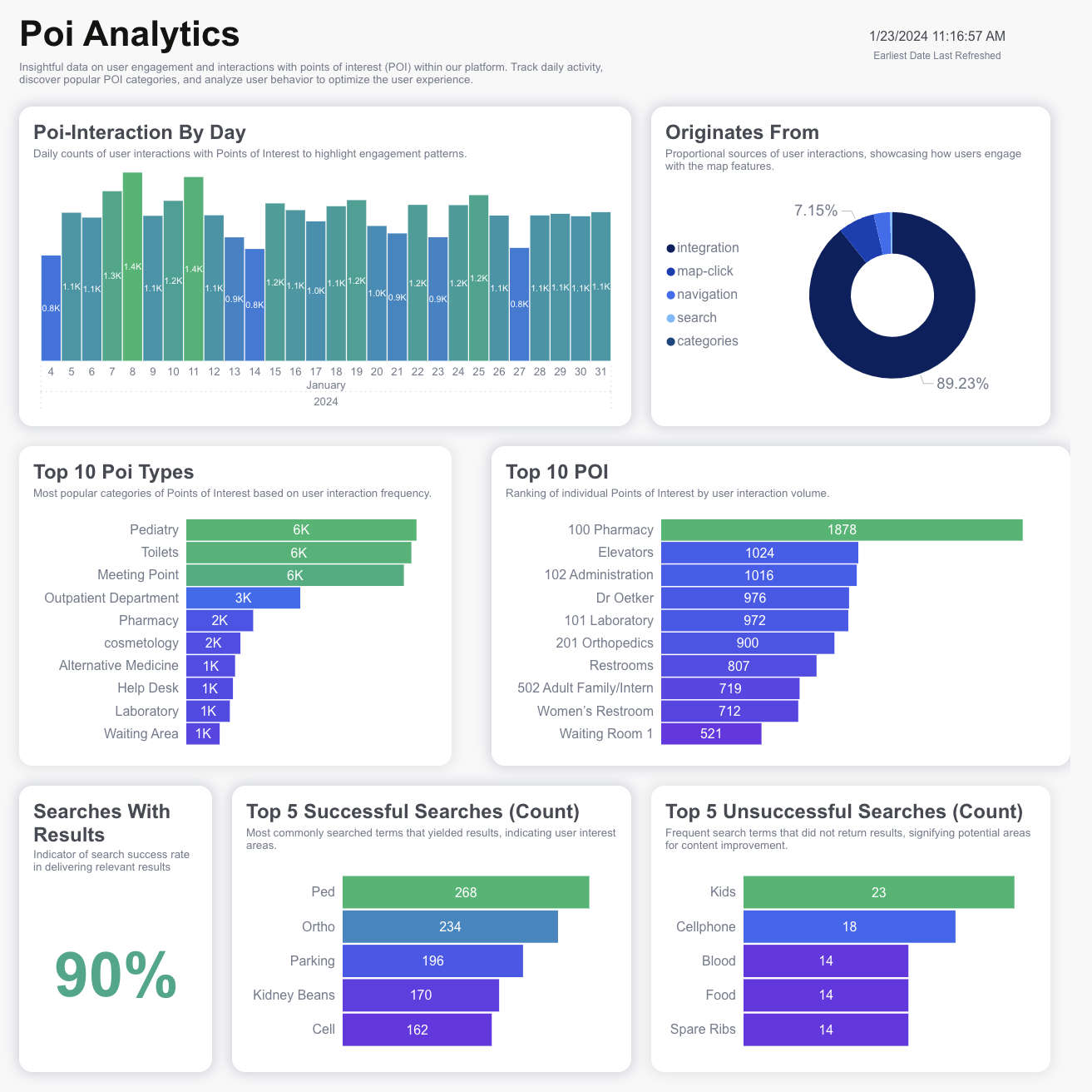
The POI Analytics section of the Analytics Dashboard provides invaluable insights into user engagement and interactions with Points of Interest (POI) within our platform. By leveraging this data, you can gain a deeper understanding of user behavior, track daily activity, explore popular POI categories, and optimize the overall user experience.
- POI Interaction by Day: Daily counts of user interactions with Points of Interest. Purpose of this graph is to highlight engagement patterns and identify peak activity periods.
- Originates from: Displays the proportional sources of user interactions. Purpose of this graph is to showcase how users engage with map features, indicating the effectiveness of different entry points. (For example: search, map-click, categories, navigation or integration)
- Top 10 POI Types: Identifies the most popular categories of Points of Interest based on user interaction frequency. Purpose of this graph is to understand user preferences and trends in POI selection.
- Top 10 POI: Ranks individual Points of Interest by user interaction volume. Purpose of this graph is to identify the most frequented specific POIs within the platform.
- Searches with Results: Indicates the success rate of searches that deliver relevant results. Purpose of this graph is to evaluate the effectiveness of the search functionality.
- Top 5 Successful Searches (Count): Highlights the most commonly searched terms that yielded results. Purpose of this graph is to identify user interest areas and popular search terms.
- Top 5 Unsuccessful Searches: Identifies terms that did not return results. Purpose of this graph is to pinpoint potential areas for content improvement and optimization.
By exploring these key metrics within POI Analytics, you can make informed decisions to enhance user engagement and tailor the platform to meet user preferences effectively.

Usage Analytics
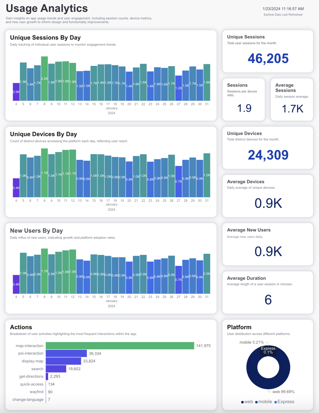
The Usage Analytics section within the Analytics Dashboard empowers you with comprehensive insights into app usage trends and user engagement. By delving into session counts, device metrics, and growth patterns, you can make informed decisions to enhance the overall design and functionality of the platform.
- Unique Sessions by Day: Daily tracking of individual user sessions to monitor engagement trends. Purpose of this graph is to understand the variations in user activity on a day-to-day basis.
- Unique Sessions: Total number of user sessions within the month. Purpose of this graph is to provide an overall snapshot of user engagement for a specific time frame.
- Sessions: Ratio of sessions to the total number of devices. Purpose of this graph is to understand the frequency of app usage per device.
- Average Sessions: Daily average of user sessions. Purpose of this graph is to identify the typical engagement level on a daily basis.
- Unique Devices by Day: Count of distinct devices accessing the platform each day. Purpose of this graph is to reflect the user reach and diversity in device usage.
- Unique Devices: Total count of distinct devices for the month. Purpose of this graph is to provide an overall measure of the platform’s user base.
- Average Devices: Daily average of unique devices accessing the platform. Purpose of this graph is to understand the average daily reach of the platform.
- New Users by Day: Daily influx of new users. Purpose of this graph is to indicate growth and platform adoption rates.
- Average New Users: Average number of new users daily. Purpose of this graph is to understand the consistent growth in user acquisition.
- Average Duration: Average length of a user session in minutes. Purpose of this graph is to provide insights into user engagement duration.
- Actions: Breakdown of user activities, highlighting the most frequent interactions within the app. Purpose of this graph is to identify popular features and user behavior patterns.
- Platform: User distribution across different platforms. Purpose of this graph is to understand the diversity in platform usage.
By leveraging these Usage Analytics metrics, you can make data-driven decisions to improve the design and functionality of the platform, ensuring a more engaging and user-friendly experience.
Note
By default, Analytics Dashboard refreshes every hour. However it’s possible to configure the refresh period. Please contact your Pointr Technical Project Manager to change the refresh period of your Analytics Dashboard.

How to activate the Analytics Dashboard?
When you login to Pointr Cloud Dashboard, you will see the “Analytics” section on the left menu. By default, example data will be displayed on these pages. Review the demo and if you want to have the Analytics Dashboard with your own data, you can click on “Get Started Today” button or contact us.
For detailed information about Analytics Dashboard, please contact your Pointr Technical Project Manager.
We are always open to your feedback to improve our Analytics Dashboard. For that: please contact from the “Request Feature” or “Submit Feedback” option on the Analytics Dashboard.